
Client.- Etnia Surf school
Location: Lima, Perú
Year: 2011 - 2015
Lead designer: Christy Zamudio (freelance project)
:::
When I met Manuel Mendoza, the owner of Etnia Surf School,
I was studying Graphic Design and learning to surf.
The challenge was to make the surf school stand out from others
and help them increase their profits.
I ended up presenting a wide range of graphic design solutions.
This included services such as branding & identity,
marketing & advertising (posters, banners, billboards,
brochures, trade show displays, BTL), event planning design,
sponsorship proposals and also surf photography.
:::
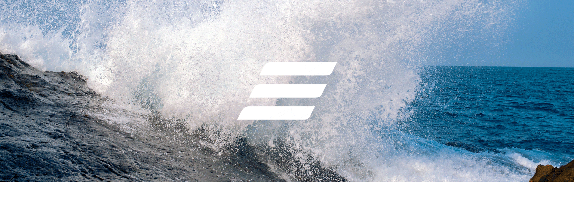
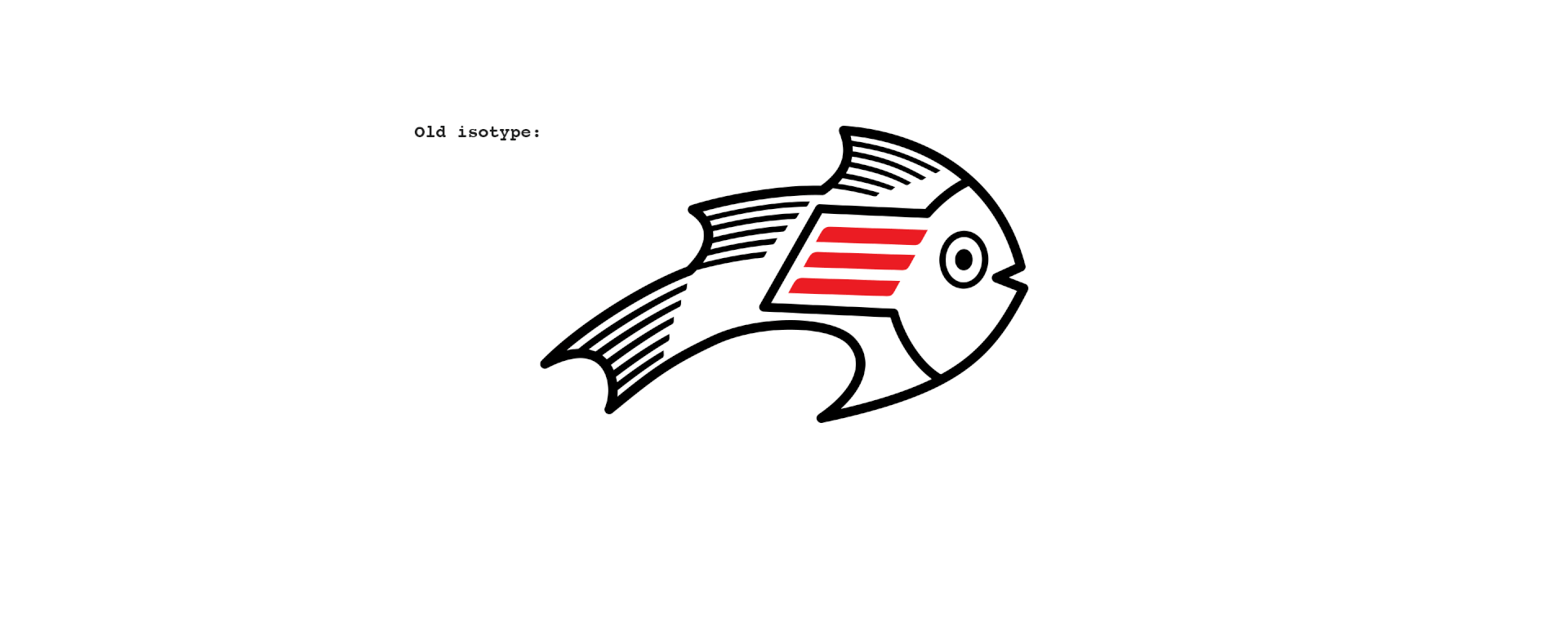
Refreshing the logo:
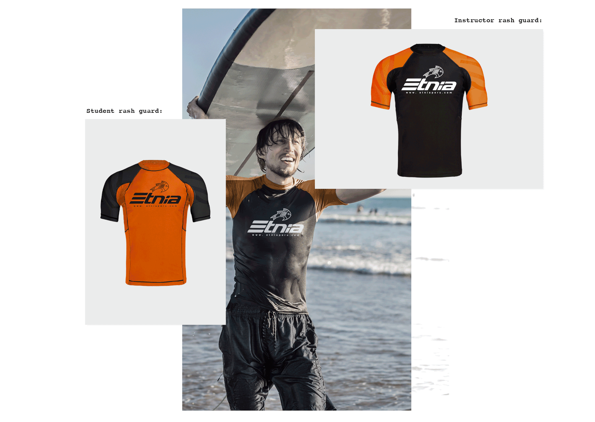
On each beach, the surf schools had agreed to choose a specific color for their rash guards in order to differentiate schools from each other when in the ocean. Usually, the schools pick their brand identity color; however, if such color had already been taken, they would pick the color closest to the originally intended.
Etnia’s representative color was red, and the agreed color for the rash guard was orange. The challenge was to make people identify the brand with the rash guards, so I decided to upgrade the logotype, and use these two colors to express the brand identity.
:::
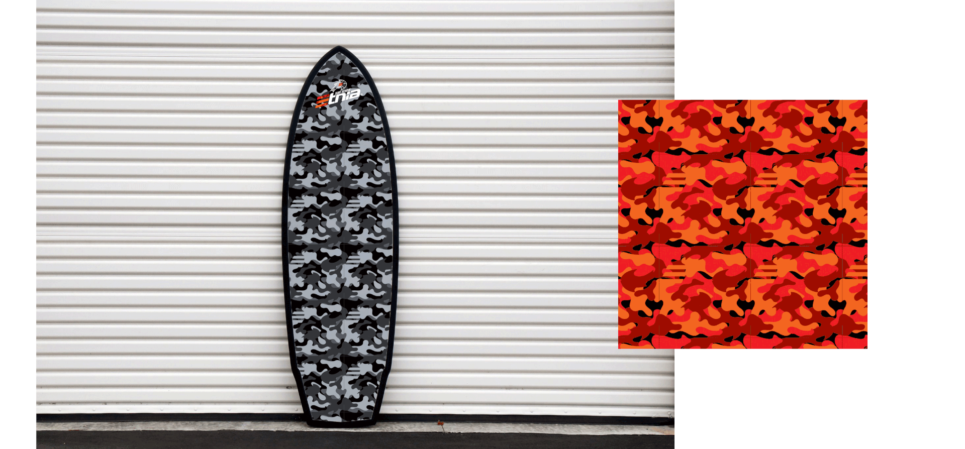
Pattern customization:
I created a customized pattern that would play with the shape of the logo, which could be used for several different applications, such as stickers, backgrounds for advertising/posters, or even clothes.
:::
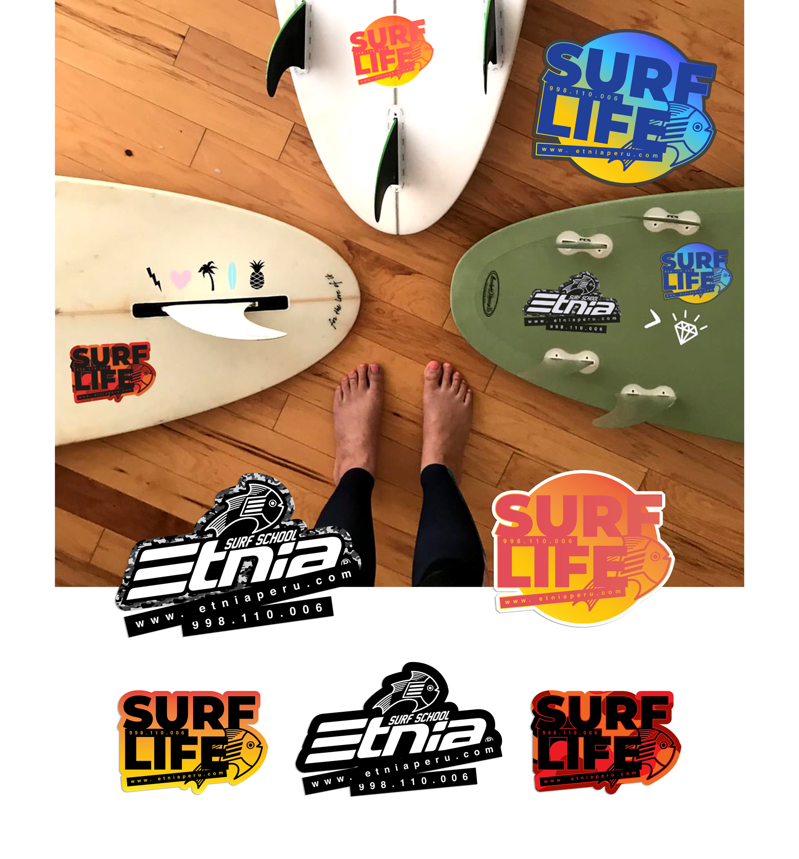
Business cards:
The surf school’s target audience are young people and kids, and therefore, more often than not, it is the parents who make the final decision on picking the surf school. Which is why we decided to have two different types of business cards: Stickers, for the younger audience, and classic business cards.
Stickers as a business cards:
:::
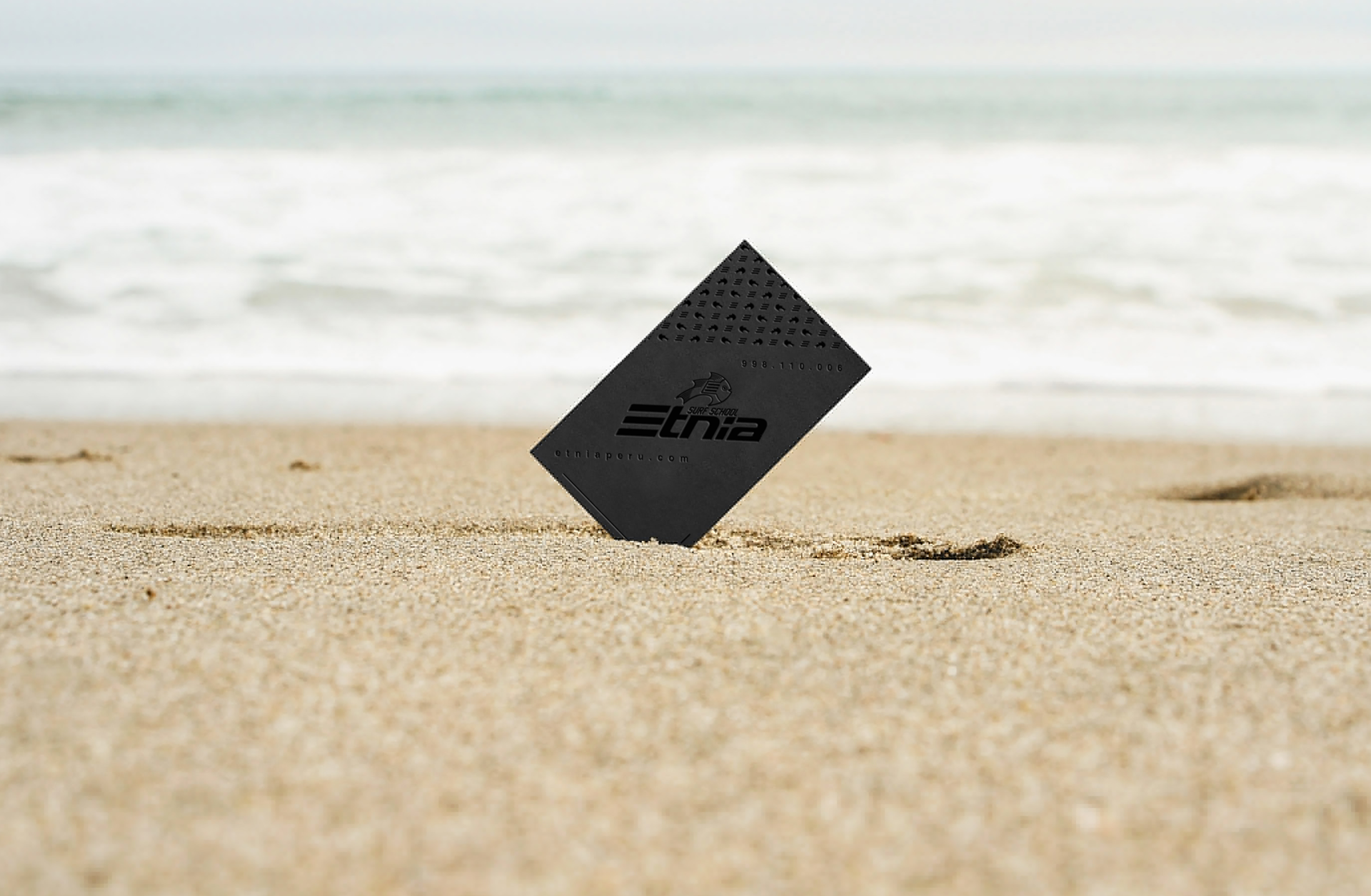
Classic business cards:
These cards were created keeping in mind the school’s sponsors and/or company managers who often hire the surf school for group classes for their workers.
:::
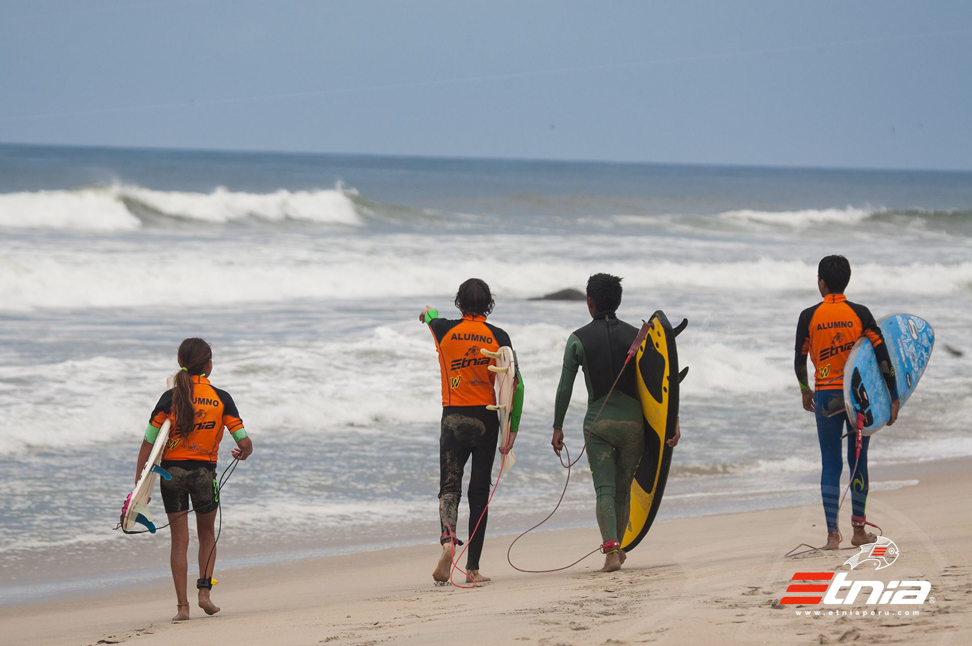
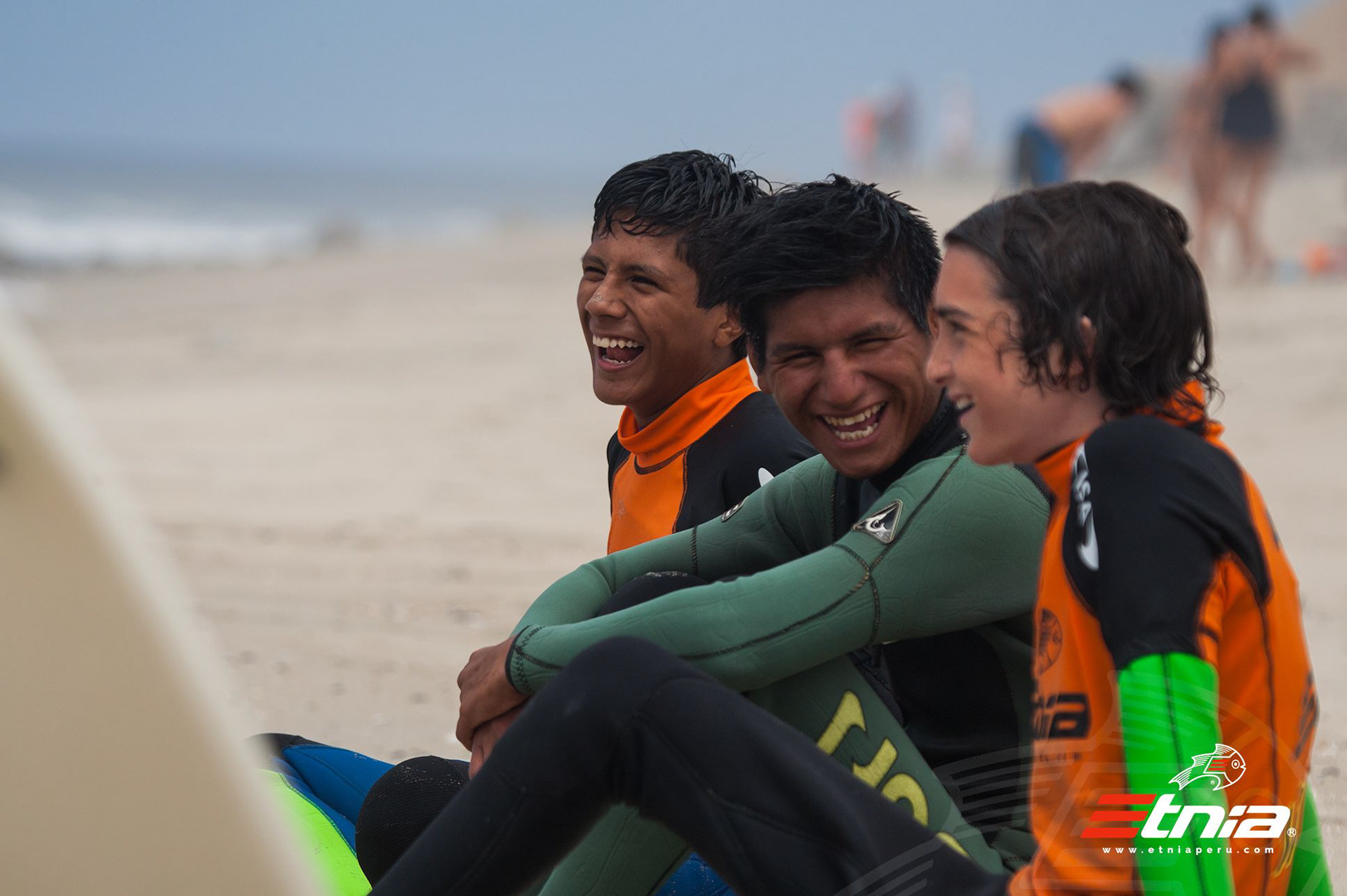
Rash guard:
In order to help improve the professional image of the school, we decided to change the design of the rash guards. At first I wanted to create a rash guard style different from the regular style, to make it stand out from the others schools, but the production costs were too high.
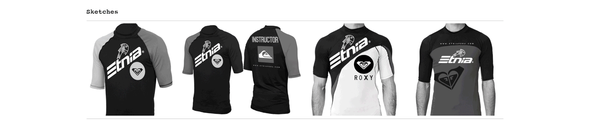
The production costs for the rash guards were extremely high and, because of the salt water, they get old very fast. That’s why we needed to keep the style clean, in 2 colors and one color ink. The end product was cost-effective, with faster production times, and easy to identify on the water, setting it apart from the other schools, which used plain colors.
:::
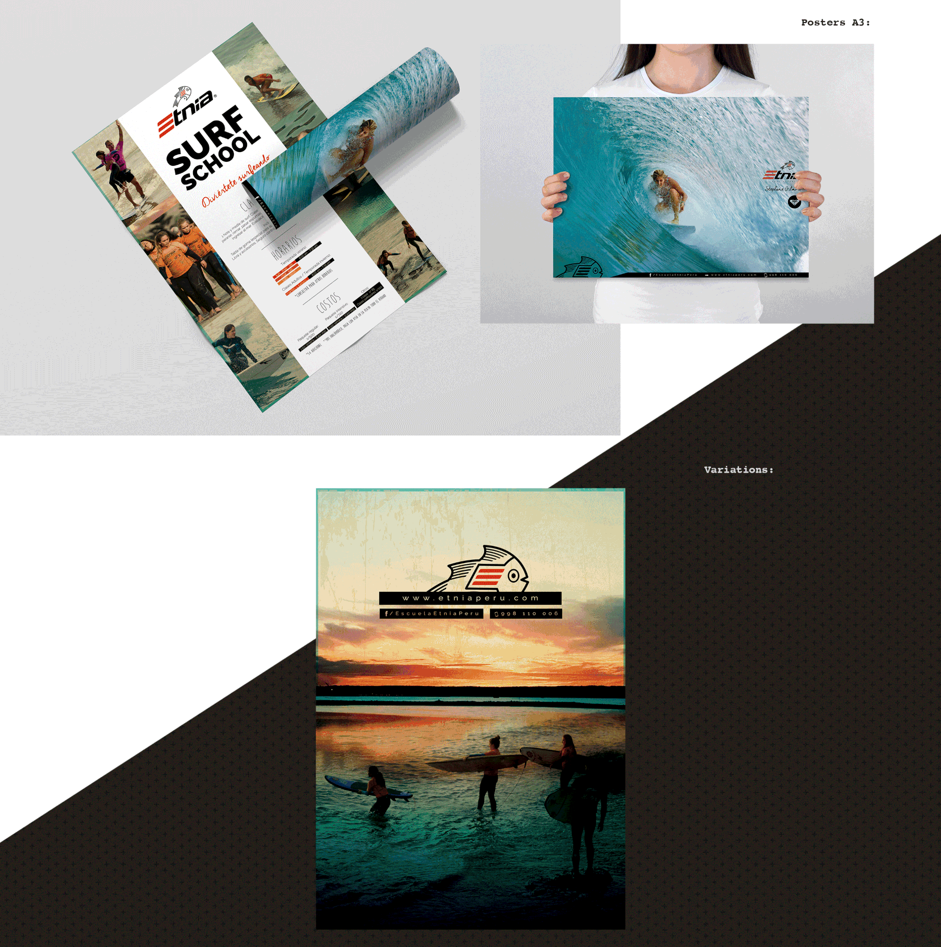
Flyers / Posters:
The surf school worked mostly with girls from schools like San Silvestre. So another way of attracting their attention was to create brochures that had posters on the backside. This way, the parents can check schedules and prices, and the kids keep a cool poster of a famous surfer.
:::
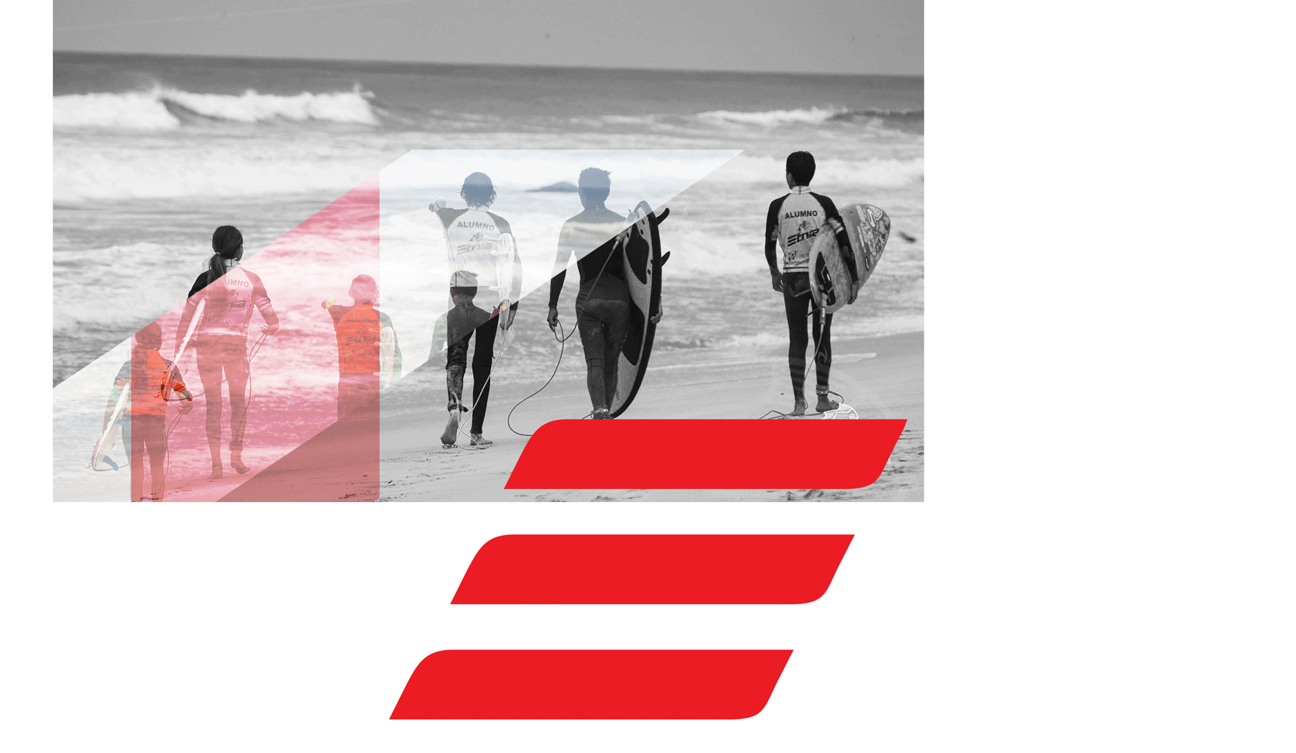
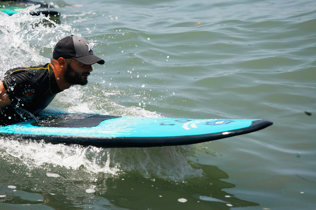
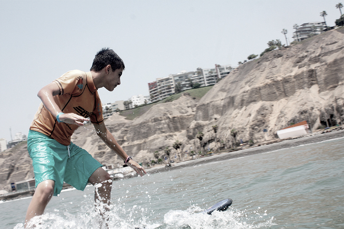
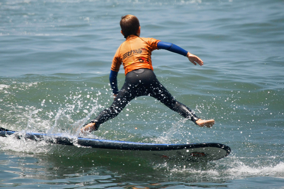
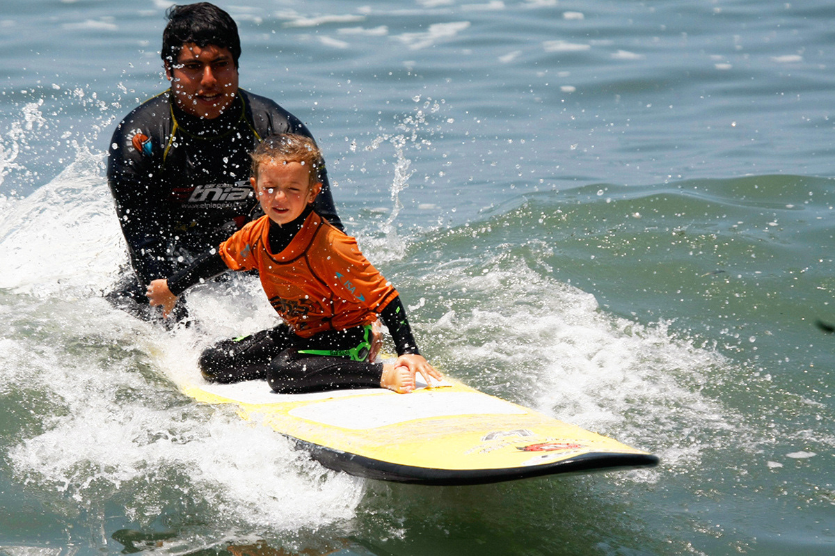
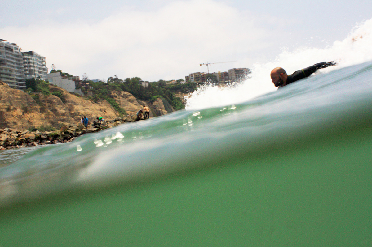
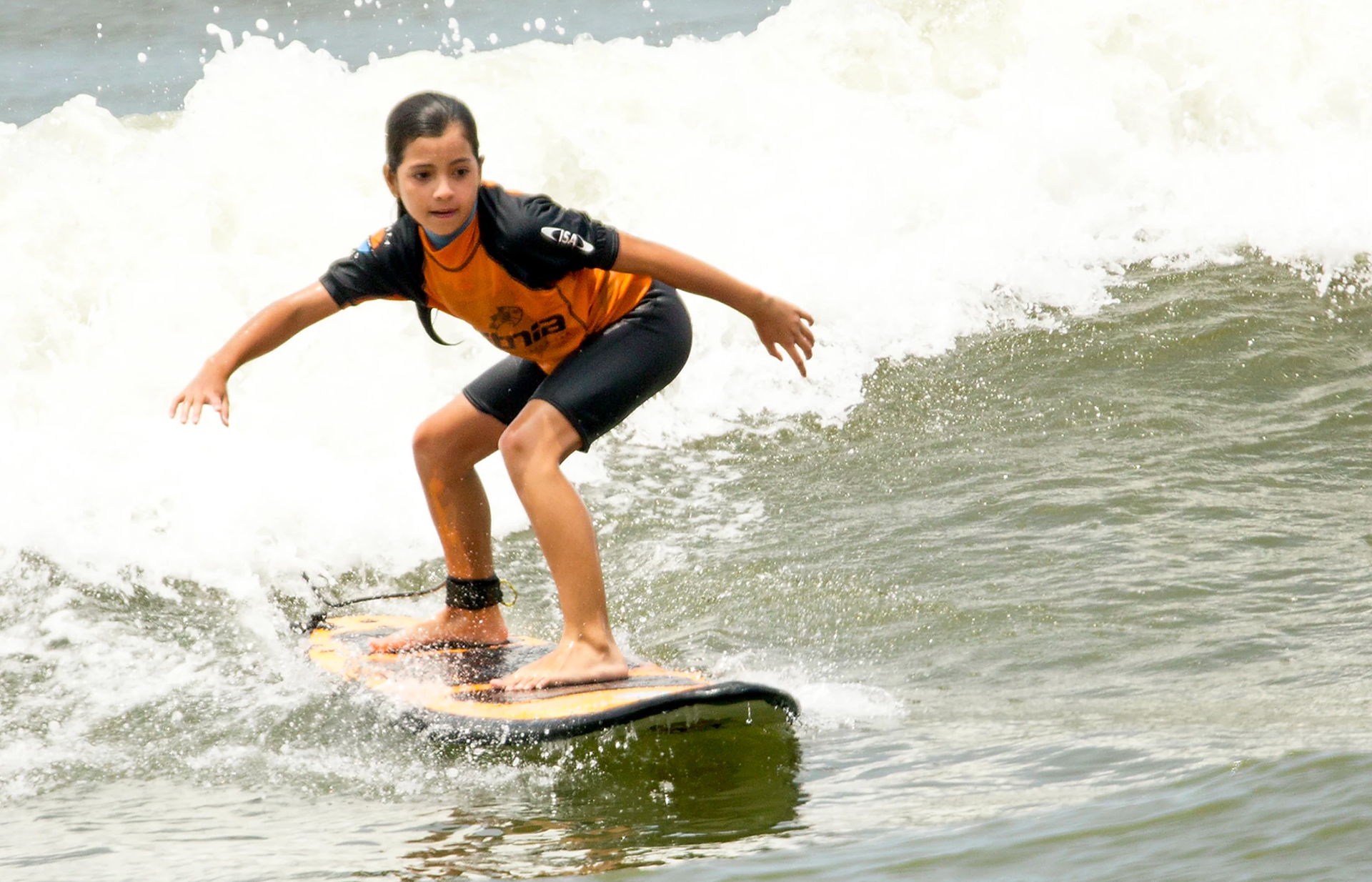
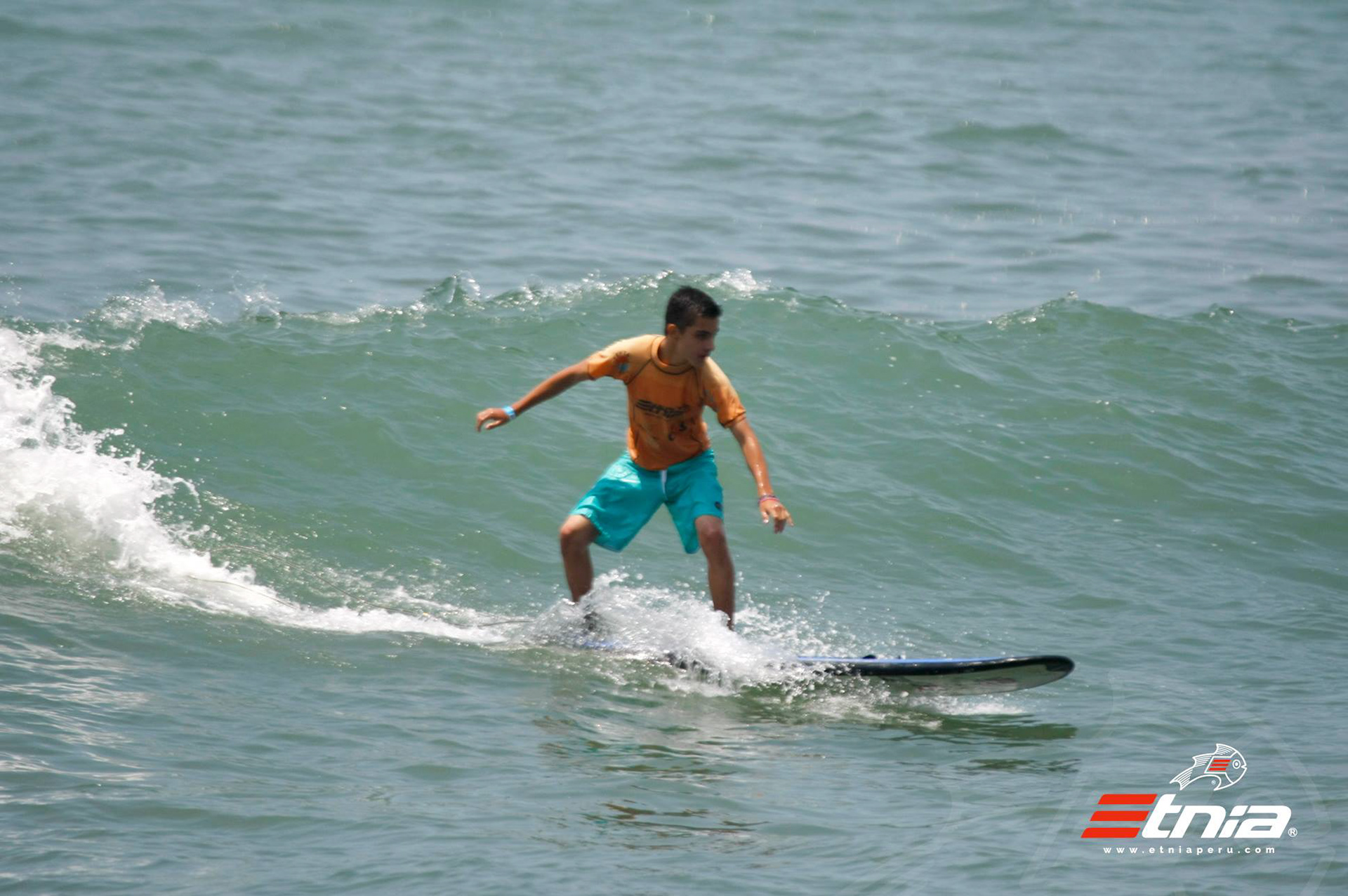
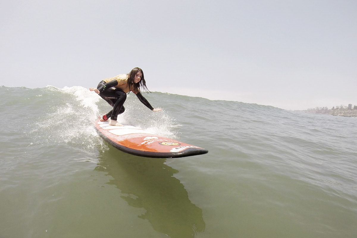
Surfing pictures as marketing strategy:
We needed something unique, something that the other schools weren’t doing, so we decided to offer taking free pictures of the students while surfing, on specific schedules.
:::
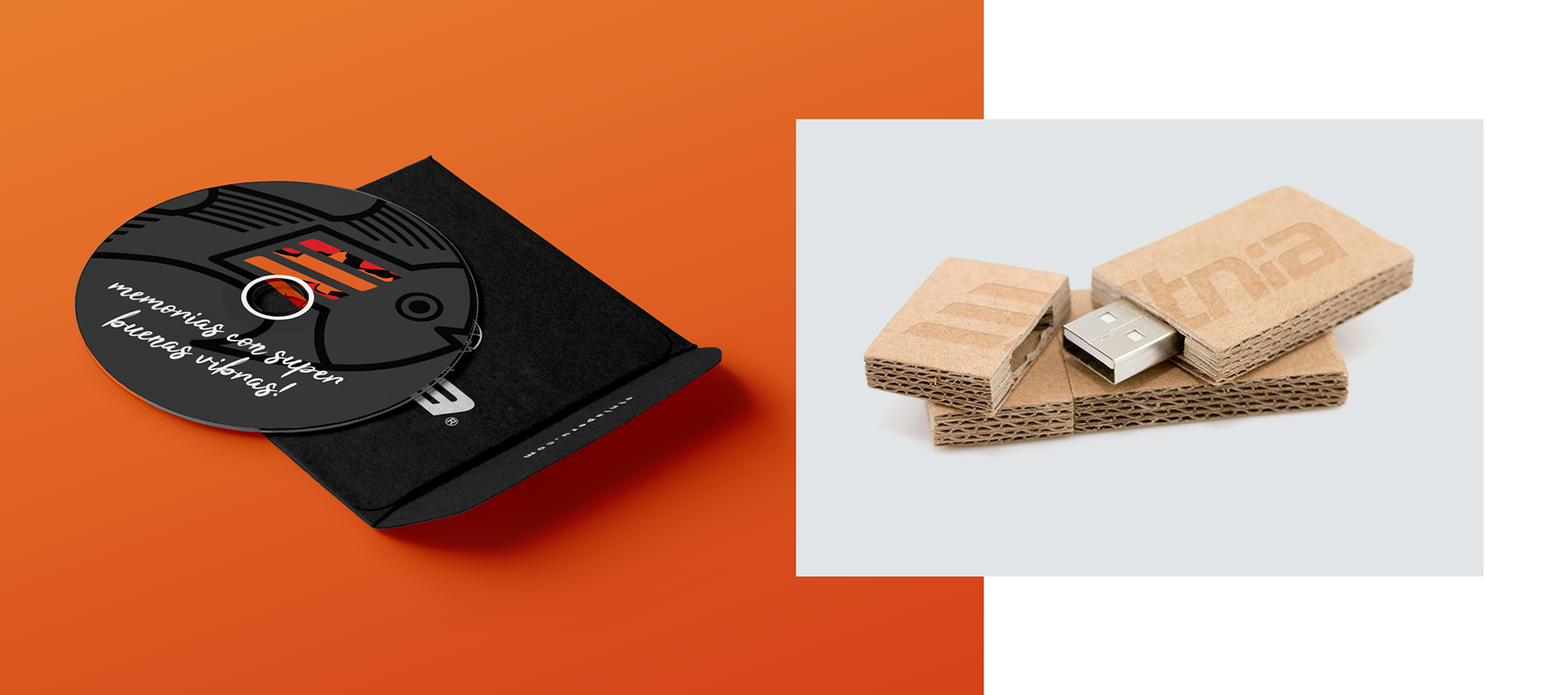
We would then put the photos and videos of the classes and give it to the company groups / teams in CDs, and later into USBs.
:::
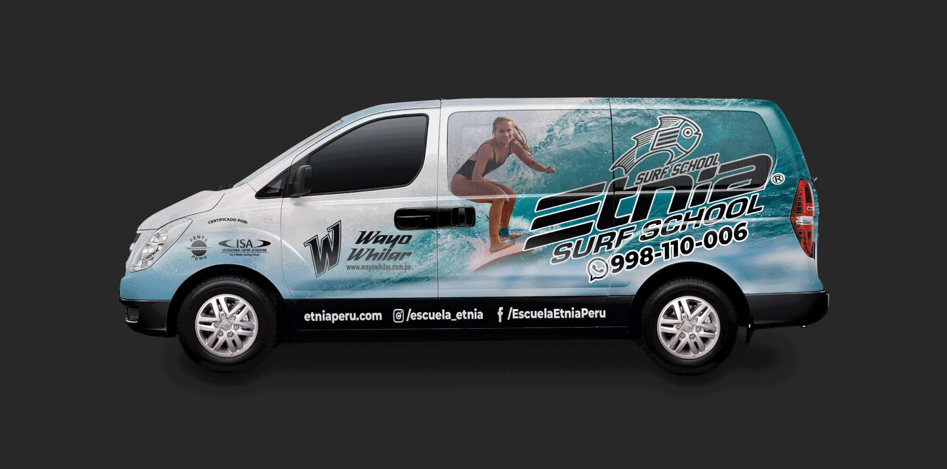
Vehicle advertising wrap:
And finally, the main piece of advertising the school has is the van. They use this van to pick the students up and do little surf trips.