
Client.- La Récolte - École Publique Alternative
Location: Montcalm, Québec
Year: 2021
Work team:
Karine Hébert (creative)
Christy Zamudio (lead designer)
:::
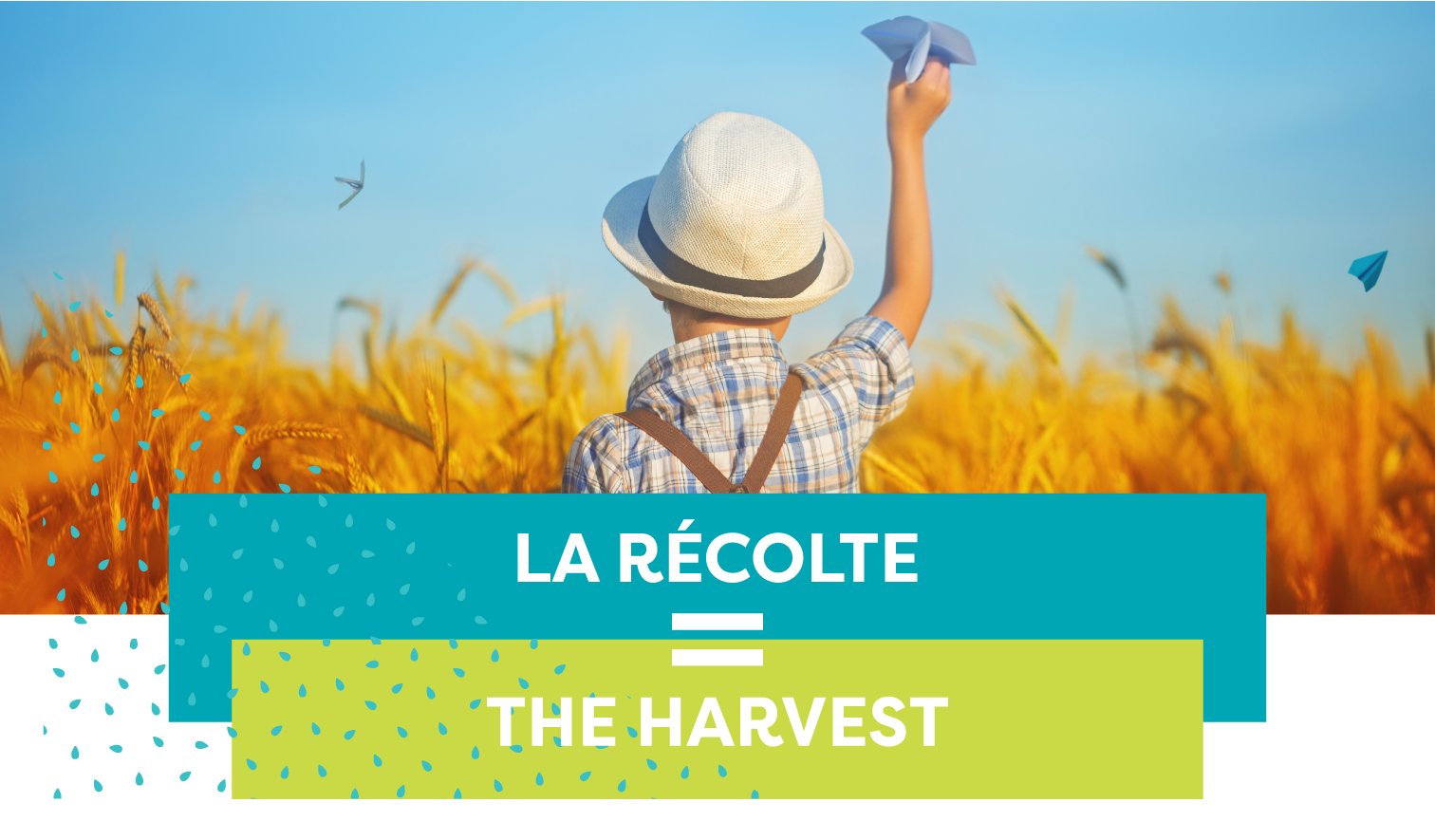
[LA RÉCOLTE]
DE L’ÉLÈVE À L’ENVOL
With all the courage, knowledge and will to help develop the little minds of the future, La Récolte, an alternative public school, aims at providing a better alternative for education in your city. This is a place where everyone can feel supported and empowered, without feeling pressure, rejection and/or fear of being judged by their looks or their intellect.
For this project I did volunteer work in the Graphic Design area, together with Karine Hébert,
and with the support of the founders of the project.
:::
:::
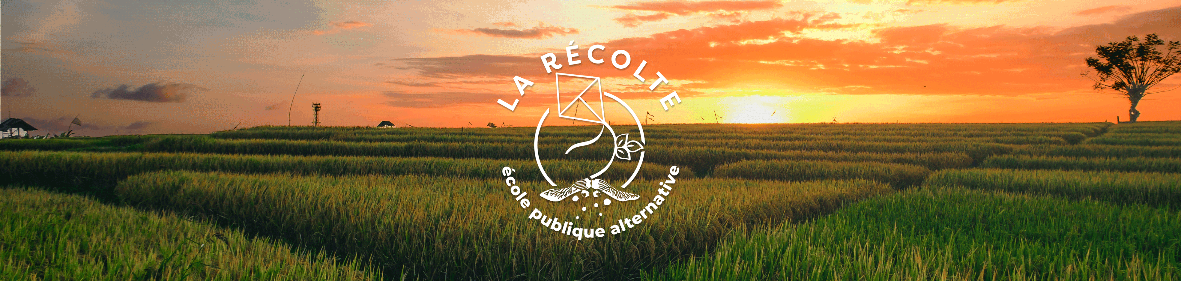
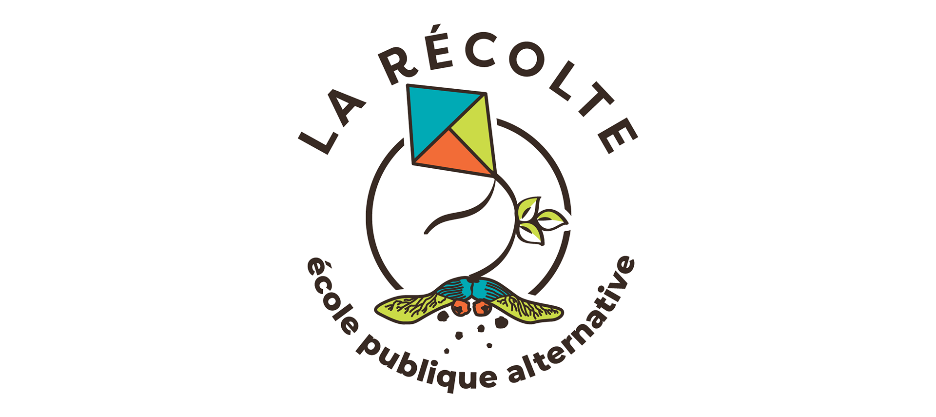
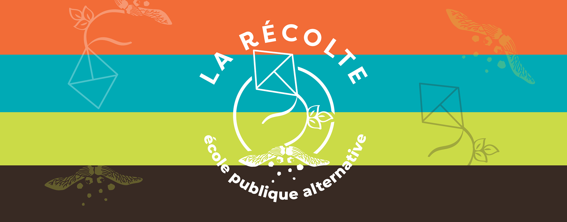
Logotype
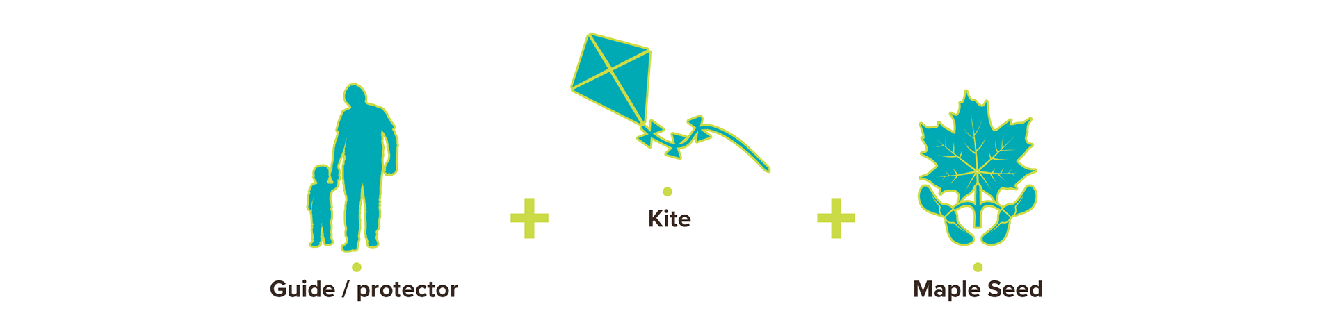
As the name says, the children are the harvest of the future, so we aimed at showcasing the logo in a visually appealing and creative way. We had a bit of fun mixing the Maple tree (Quebec’s representative tree) seeds, a humanoid vertical shape that represented evolution and learning, and a kite that represented freedom, a symbolism for having wings and being able to be who you want to be.
:::
:::
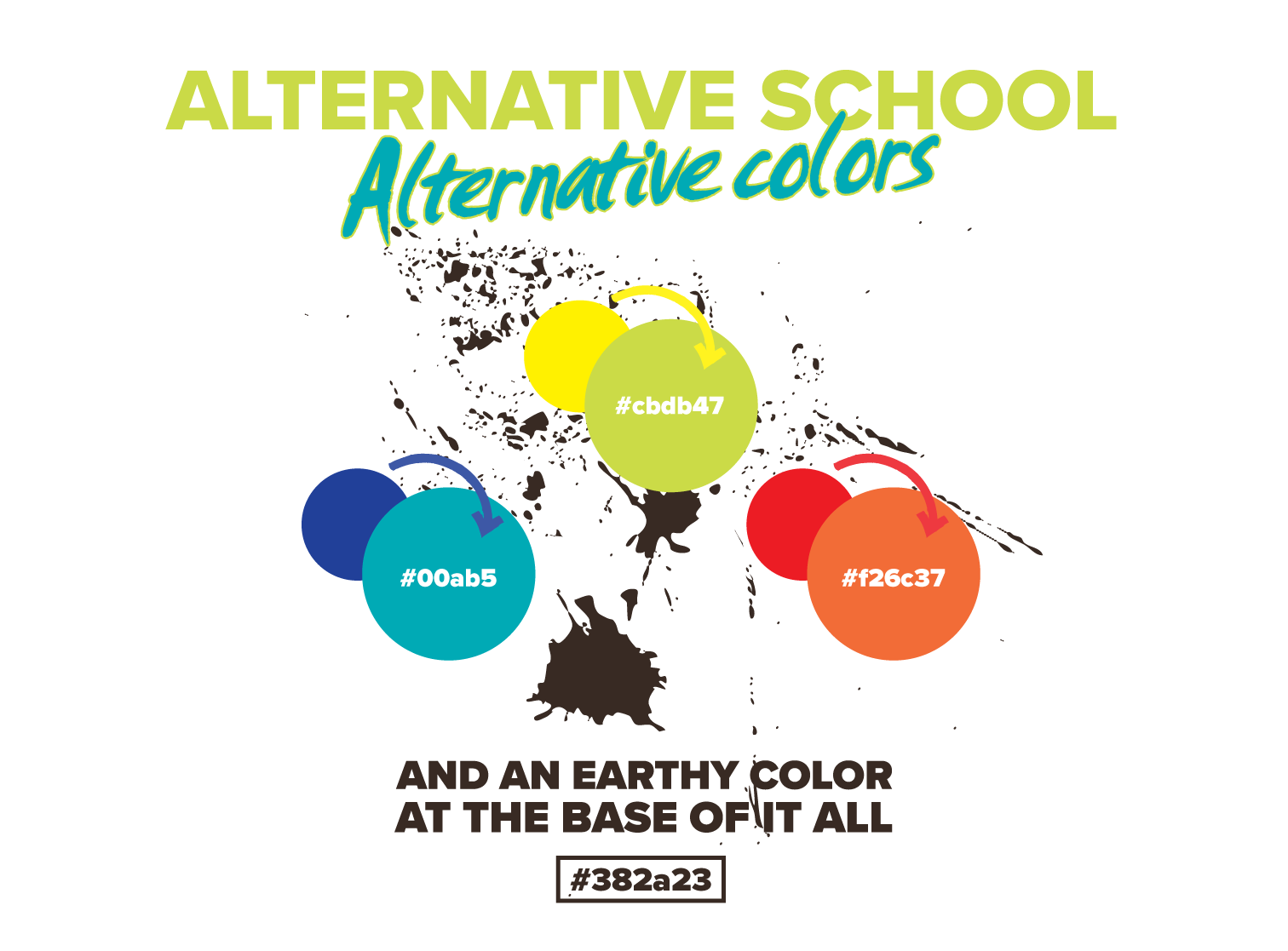
Since it is a school, it does follow some rules; however, all the work is done in an alternative way, following education rules and/or regulations but from a different perspective. This is the concept that we sought to achieve with the colors of the logo: an alternative grasp of the basic colors.
:::
:::
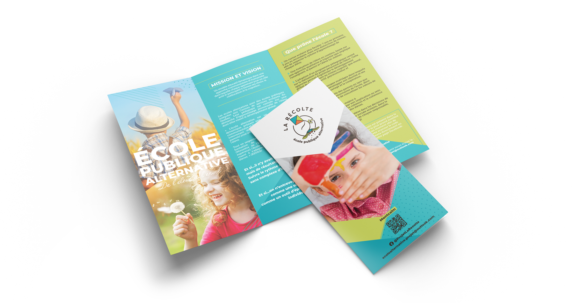
BROCHURE
This is a new school, so the first step to take, besides the corporate image, is to be able to explain what the school is really offering to society in order to recruit students.
We created an information brochure on the benefits of an alternative school.
:::