
Client: Sandwich Cartel
Category: Food Cart Business
Location: Portland, OR - USA
Year: 2017
Work team: HODIO (Independent Advertising Agency)
Josema Hoyos (creative writer)
Christy Zamudio (lead designer)
Mission:
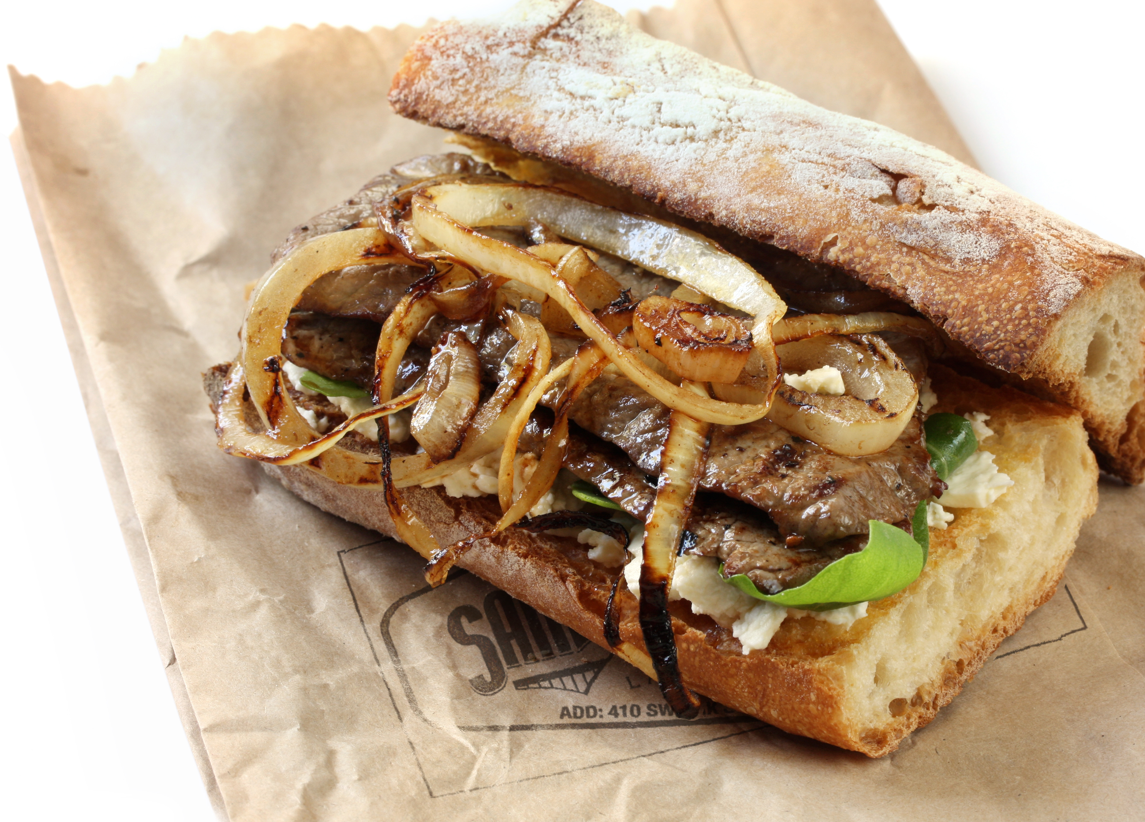
Norberth Marticorena, the owner of Sandwich Cartel Food Cart, was looking for someone who could help him to develop his new project, which consisted of a Latin fusion food cart. The cart was located in a food cart pod, and the owner wasn’t sure about the development and values of the brand. The challenge in this case was to make this particular food cart stand out, with very low budget and flexible design, because they wanted to be able to experiment with new menus and ideas. The owner needed someone who could understand the Latin spirit, from its language to the graphic design, so that it could portray the essence of this mix of cultures and attract the American market.
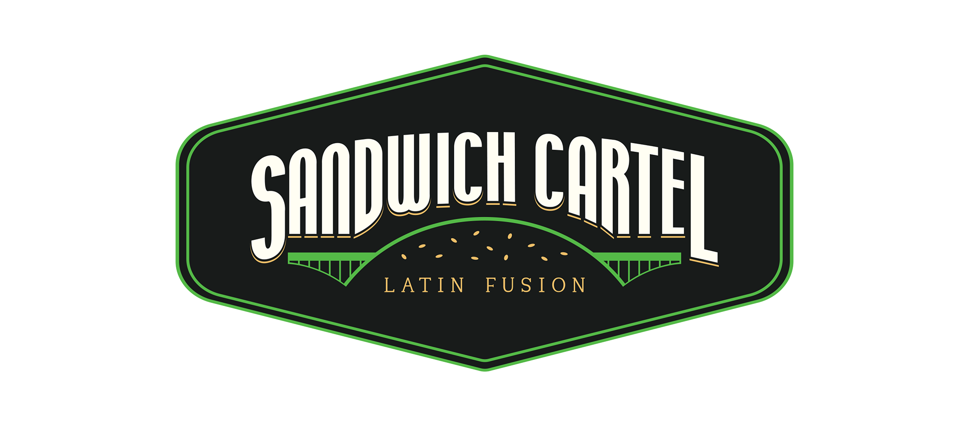
The essence of Portland in a logo:
We applied a deep research and analysis of Portland’s people and market, and observed that there were a few repetitive and outstanding findings. The first finding, and one of Portland’s most recurring icons, are its bridges, which we can see all over the city. The second finding we obtained from walking the main streets were the classic wood and metal signs, which gives this “old town” vibe. We also found that a large part Portland’s people prefer to consume organic and local products.
These were the 3 pillars we used for the creation of the logo.

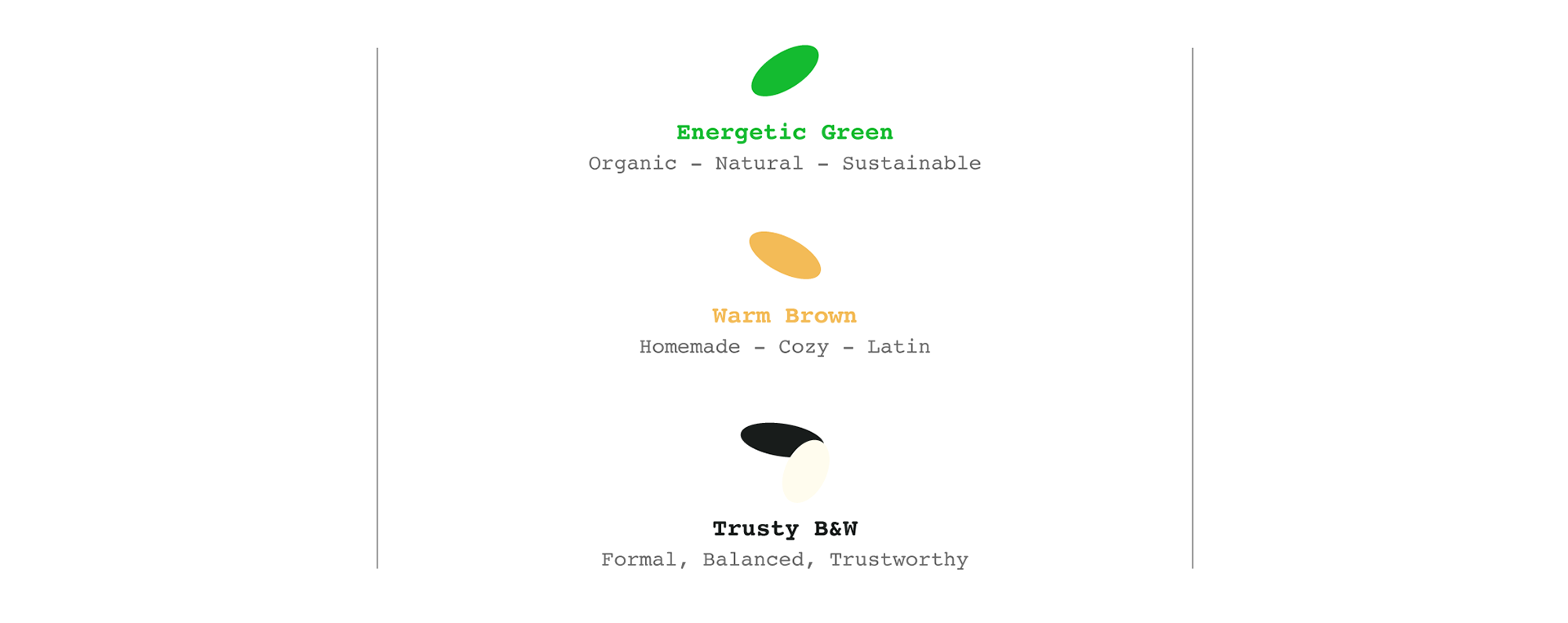
Color interpretation:
Brand development:
The challenge was to create a brand and advertising pieces that would not depend on the packaging or any permanent structures because they were testing different products and menus. In addition, one of the fundamental axes of the brand was environmental sustainability.
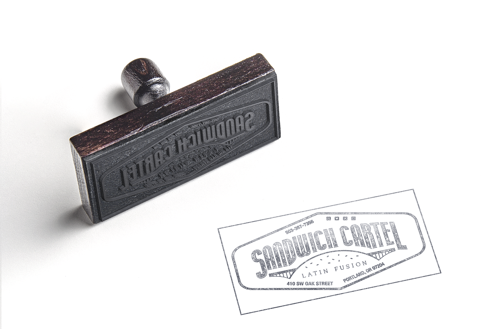
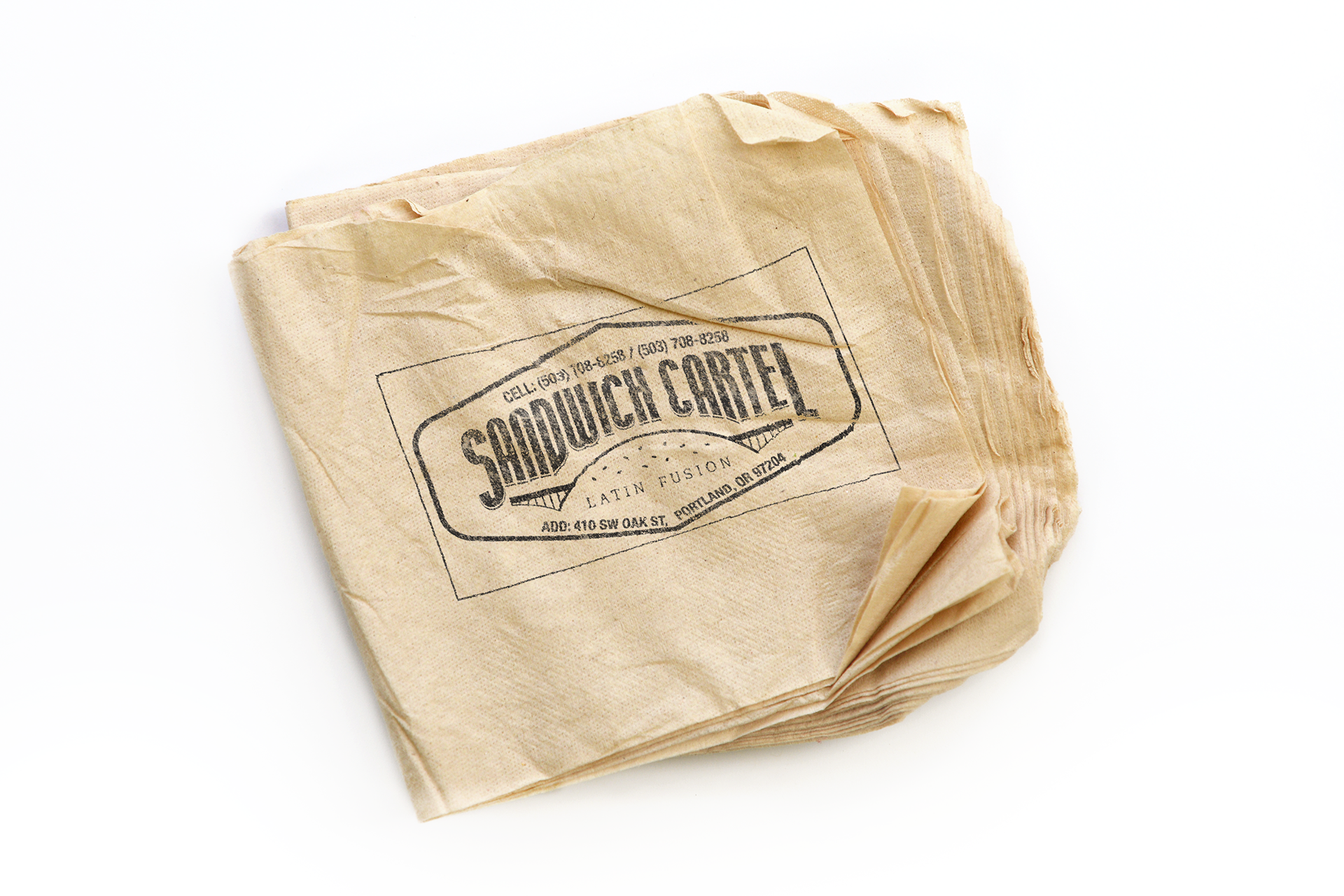
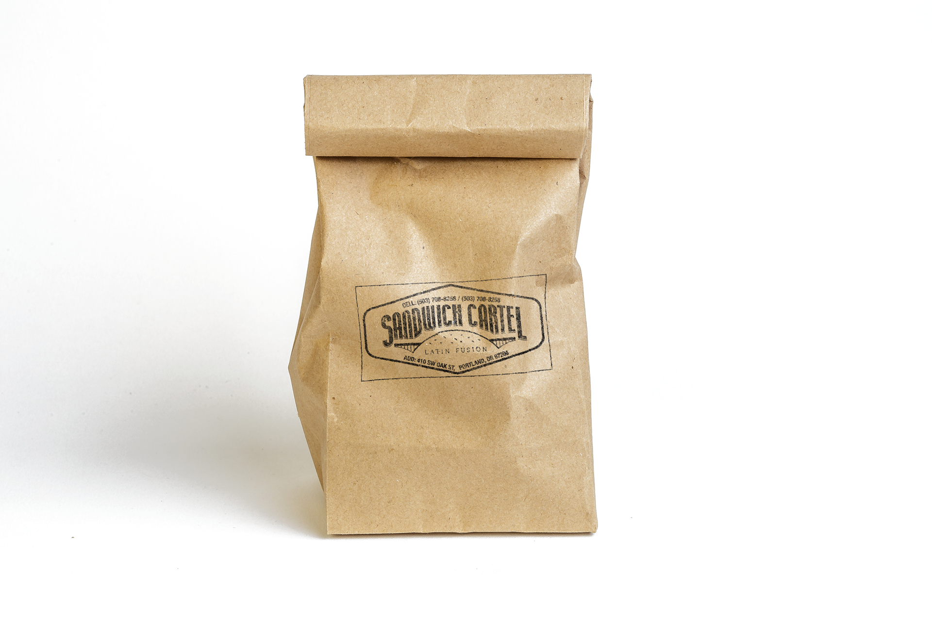
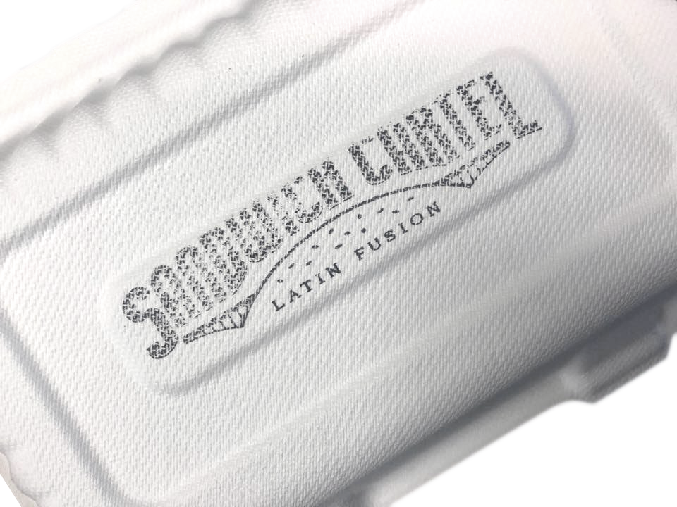
The stamps:
We decided to implement the classic wood rubber stamp as an advertising device, and made them in 2 different sizes. This gave us a wide range of possibilities, because it could be used over different surfaces, such as paper bags, recyclable containers and napkins.
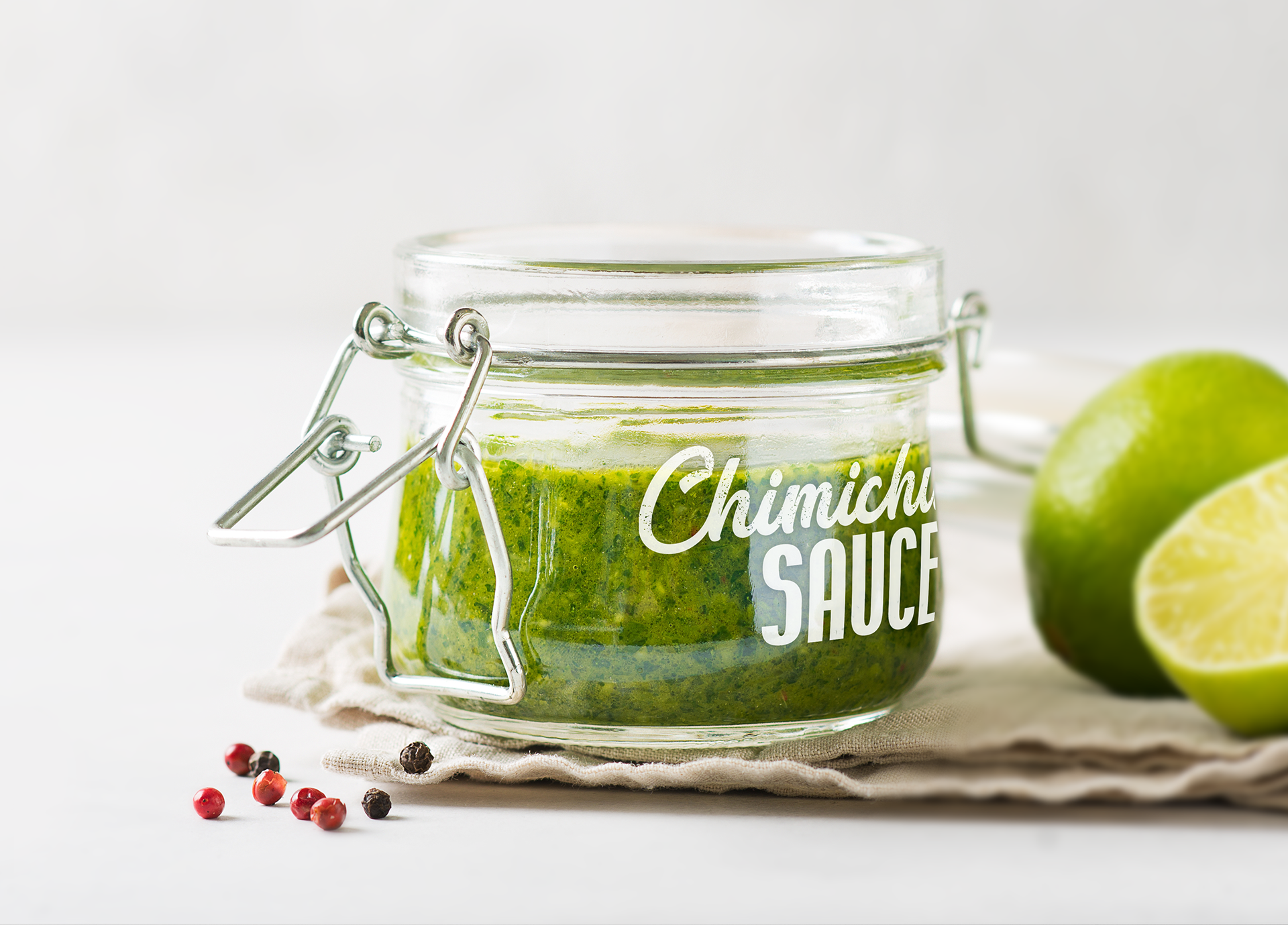
Reusable jars for sauces:
The cart began selling their sauces in reusable jars, and since the stamps don’t really work well in glass, after trying a few methods we decided to use decals. The idea was that customers could easily reuse the jar or claim the money back for the jar if they return them. This option wasn’t too eco-friendly, but it was the most flexible and durable.

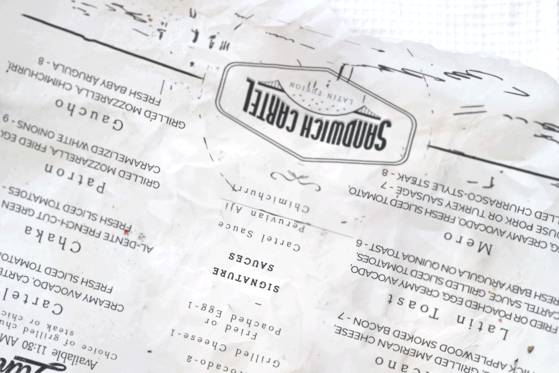
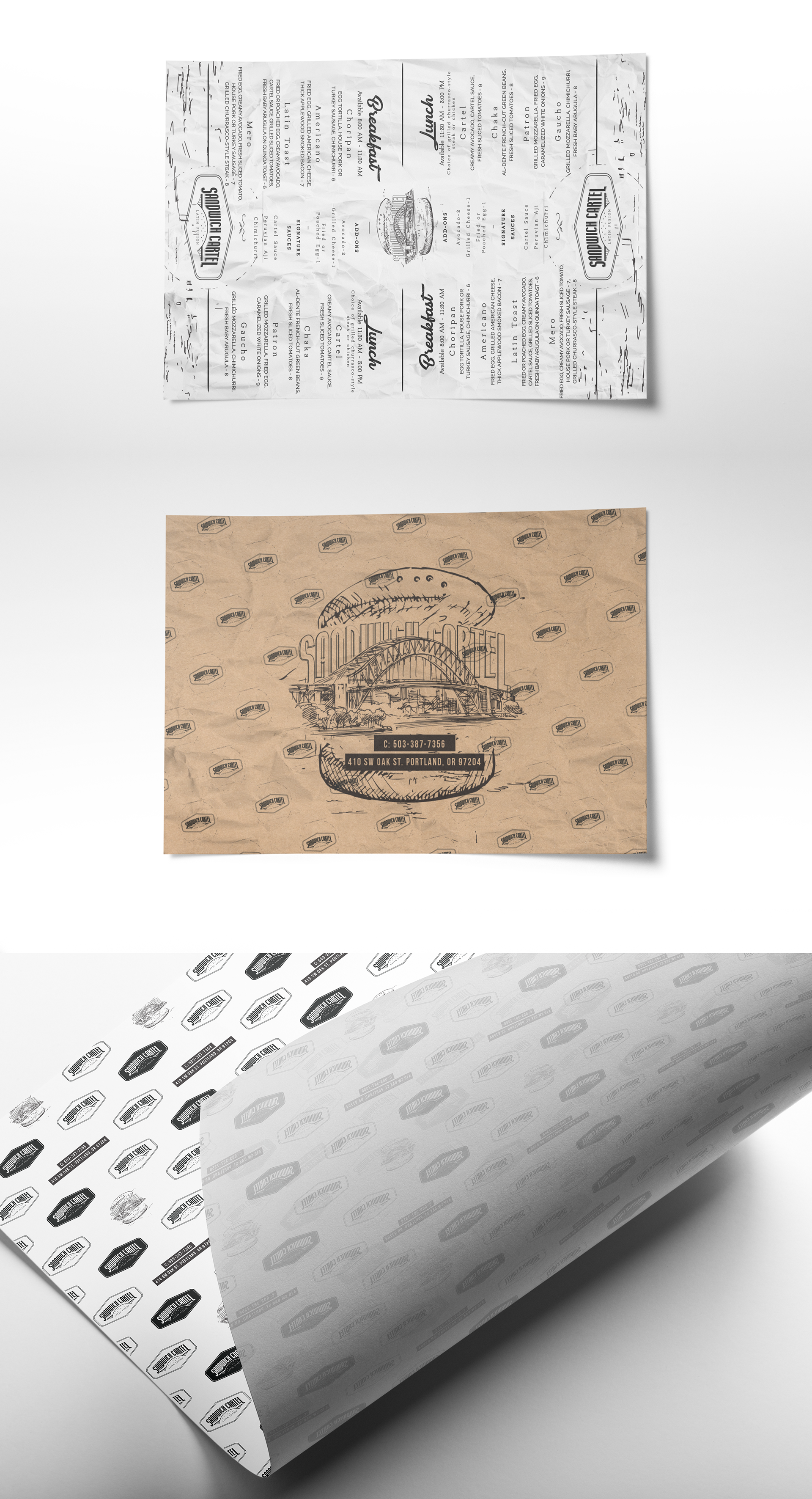
Business food wrap:
Using the same principle, we aimed at making multi-purpose pieces. So we came up with the idea that the menu should be printed in the food wrappers, making them useful as a business card and the menu.
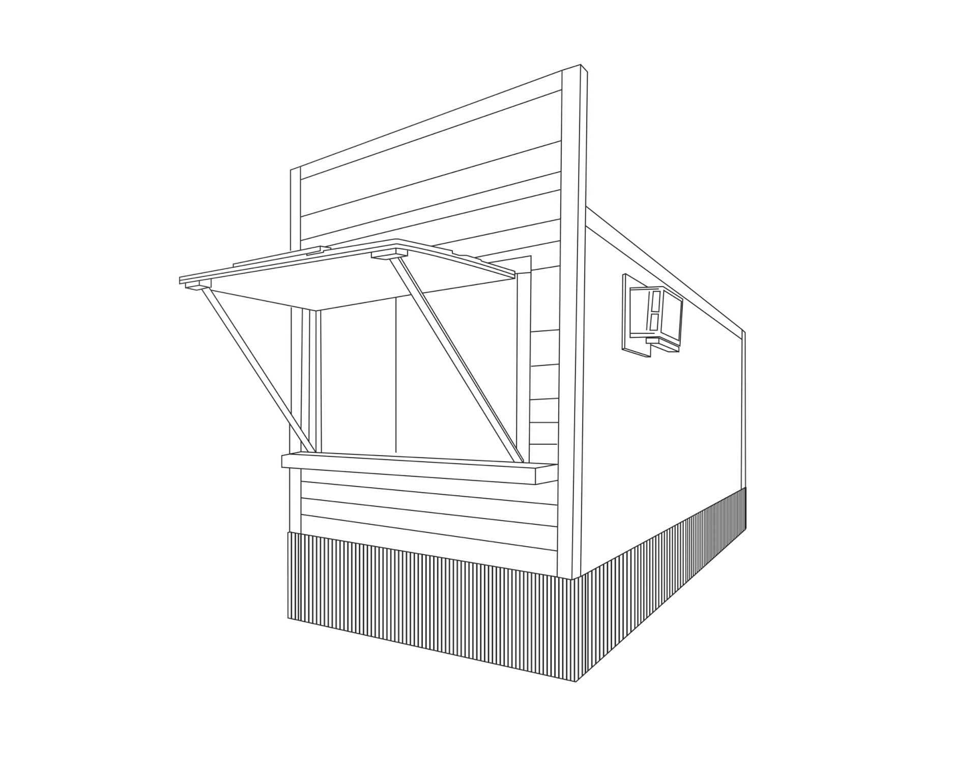
STAND RENOVATION
Meeting all these requirements, we designed the cart
focusing in the following three main elements.
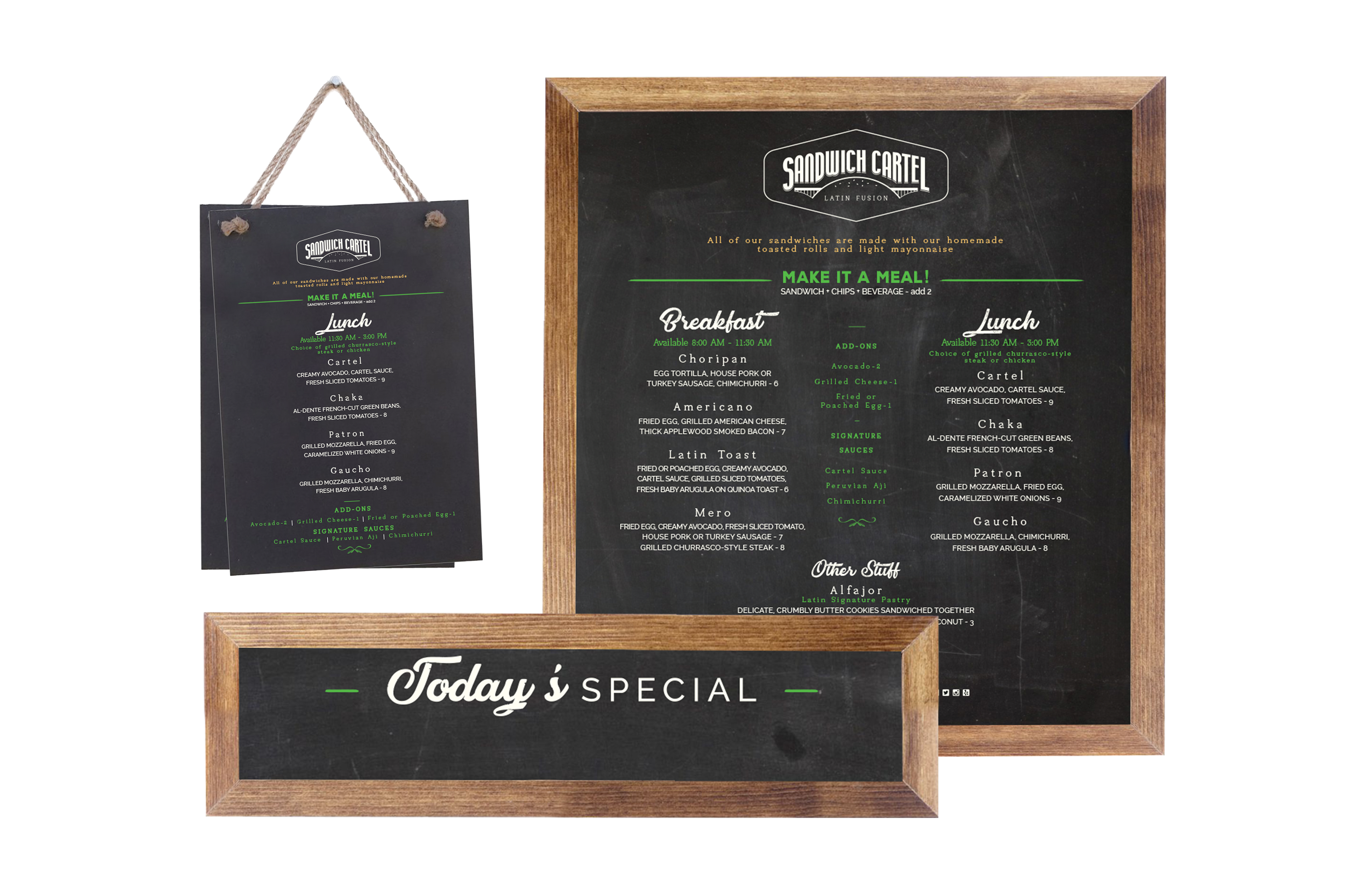
1. Boards:
Classic town, classic signs. As we mentioned before, they needed to try out new sandwiches and experiment with part of the menu, so we needed to make this a flexible process, that’s why we decided to go for the classic boards. This way, the permanent menu was going to be printed on a big board and small sheets, and the classic boards would be handwritten with, for example, “today’s specials”.
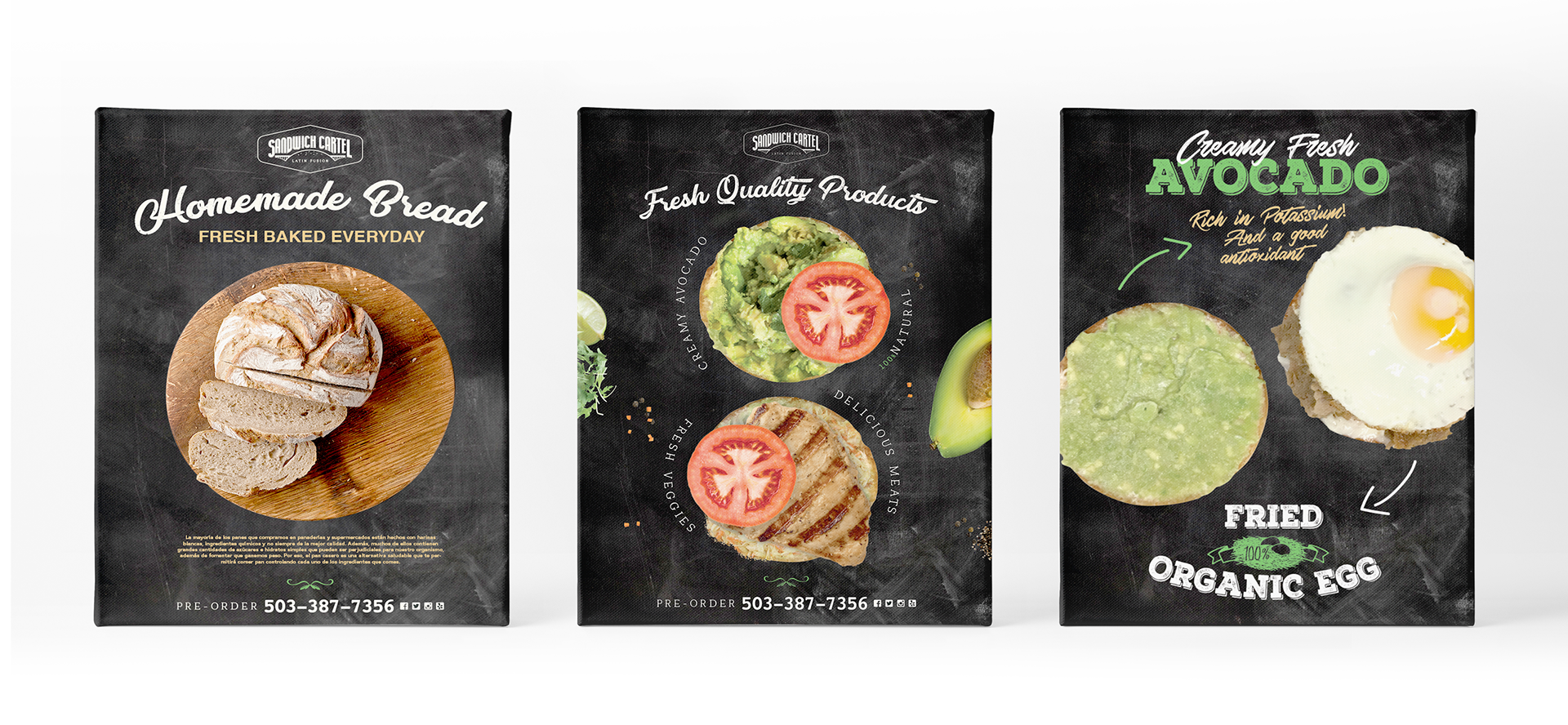
2. Canvas:
We also needed some spaces to show the most outstanding characteristics of the business, such as the fresh homemade bread or the organic featured products, so we decided to use 3 printed canvas to portray that, which would be sometimes interchanged with the handwritten boards.
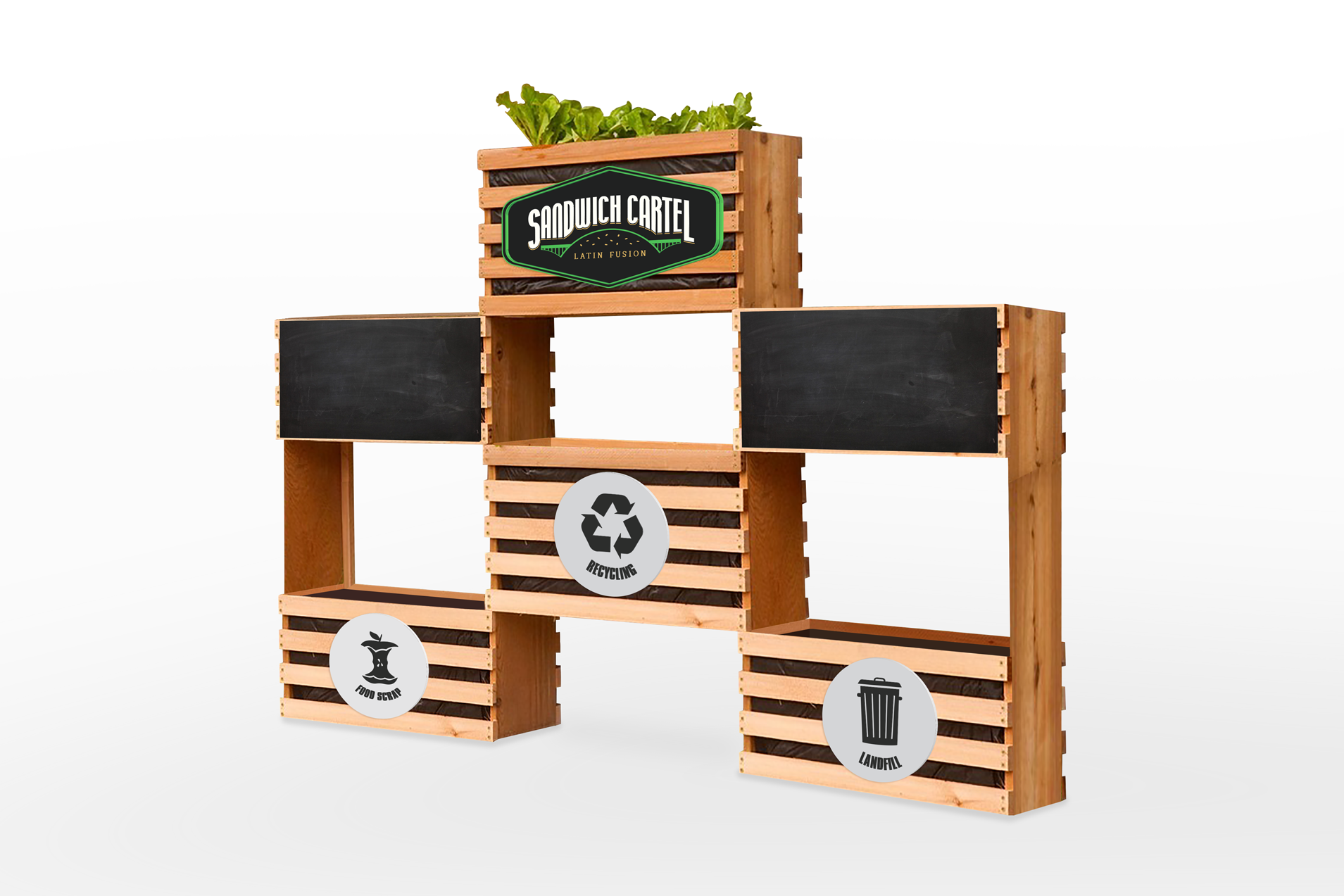
3. Functional deco:
We wanted this place to feel super cozy on every way, so we decided to create a space that was more than just the disposal area. We fitted it so that people would also be able to leave their comments and suggestions, and also making it more appealing to the customers.
The food cart:
As a result, the whole food cart becomes this cozy little space, making it stand out from the others.